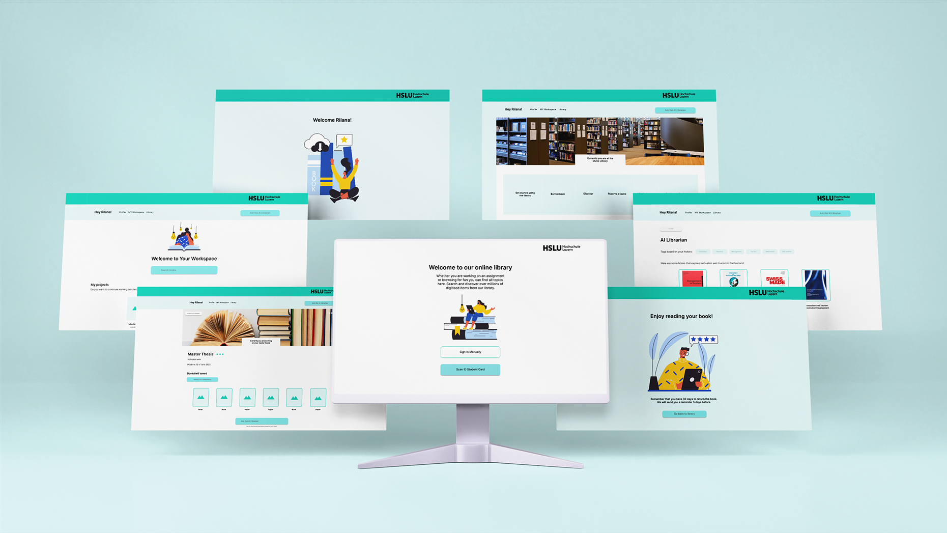
Möbel Märki is a Swiss-based furniture company offering stylish, sustainable, and high-quality furniture at accessible prices. Despite its strong product and service offering, the website lacked clarity and ease of navigation, making it difficult for users to understand the range of services and products available.
How might we redesign Möbel Märki’s website to increase customer engagement and create a more personalised experience for each user?
Key Activities:
Website audit to identify usability issues and gaps in information architecture.
Competitor analysis in the Swiss and German markets.
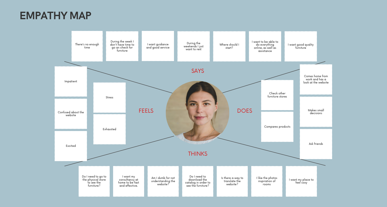
Creation of a target persona based on a real user scenario (Sara, a newly relocated professional with limited time for furniture shopping).
Empathy mapping, product vision definition, and service onboarding redesign.
Design system creation in Figma.

Solution
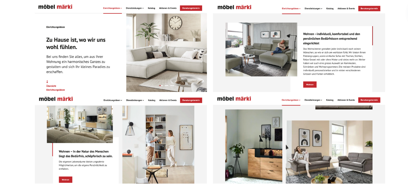
- Redesigned the “Services” section to highlight Möbel Märki’s design consultancy offering.
- Improved onboarding flow for design services with:
Icons, photography, and clear service descriptions.
Step-by-step explanation of the consultancy process.
Team introduction to increase trust.
Streamlined contact form for service requests.
- Maintained the existing brand visual language to ensure consistency for returning customers while improving usability and hierarchy.
Impact
Simplified the process for users to discover and book design services.
Enhanced service visibility, making it a clear competitive advantage.
Improved brand perception as a consultative, service-driven retailer rather than only a furniture seller.
This project demonstrated the importance of aligning service visibility with user needs and maintaining brand recognition while improving usability. It reinforced my approach of starting with research, grounding solutions in real user scenarios, and delivering designs that balance business goals with customer experience.